Will Fuller
Swipe Save
Scroll down
iOS / Android Mobile App
UX Design
UI Design
Claude Code (React)
Figma MCP Server
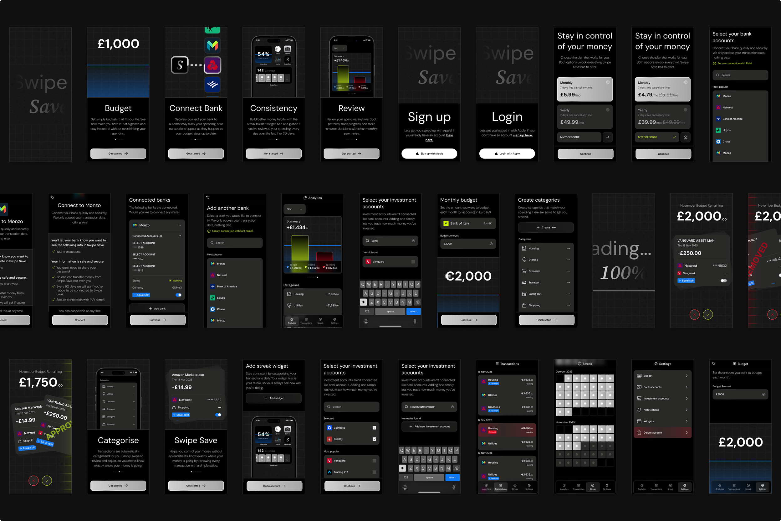
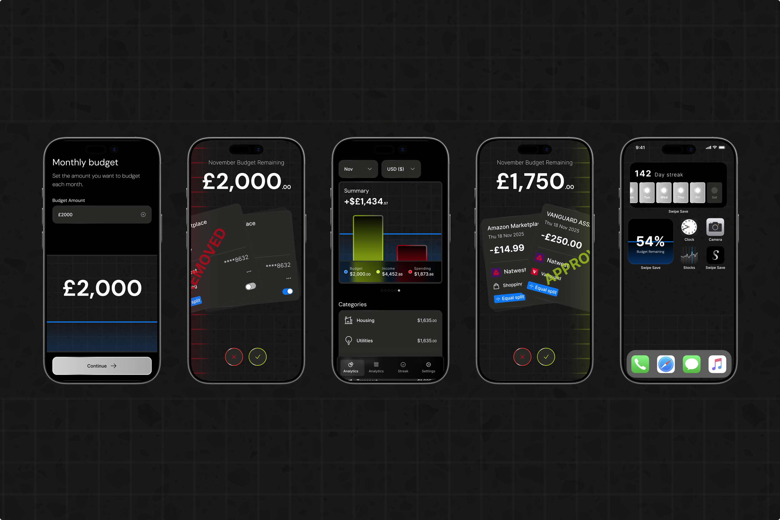
Swipe Save is a personal project I've been working on. It's a mobile budgeting app that connects directly to your bank accounts via Plaid and rethinks how people review and categorise their spending.
Instead of trawling through long transaction lists, Swipe Save presents each transaction in a Tinder-style swipe interface. Users can quickly approve, remove, or edit the auto-assigned category for every transaction, with streaks to encourage consistency. The goal is to help users know exactly when, where, and what they're spending money on while making budgeting feel lightweight and even enjoyable.
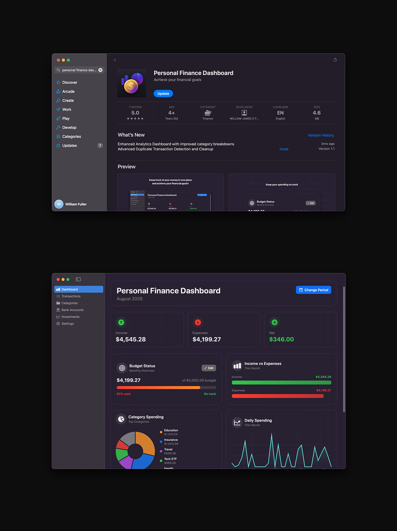
Around six months ago, I began experimenting with AI tools to explore how far they could take me in both design and development. The first app I built and launched on the App Store was a simple Mac budgeting app. It allowed users to upload CSV bank statements, categorise transactions, and track budgets.
While building that app, I found that Claude Code performed best for my workflow. One clear limitation, however, was UI generation. AI generated interfaces often look generic and unpolished. I found better results when prompting with specific design systems such as Apple's iOS design language which I used successfully in my Mac app.
Although I still use my Mac budgeting app, I became frustrated with how manual the process was due to the lack of direct bank connectivity. Since building it, my workflow with Claude Code has improved significantly, and by connecting it to an MCP server and sharing Figma designs, I'm now able to create truly custom UI that goes far beyond generic AI output.
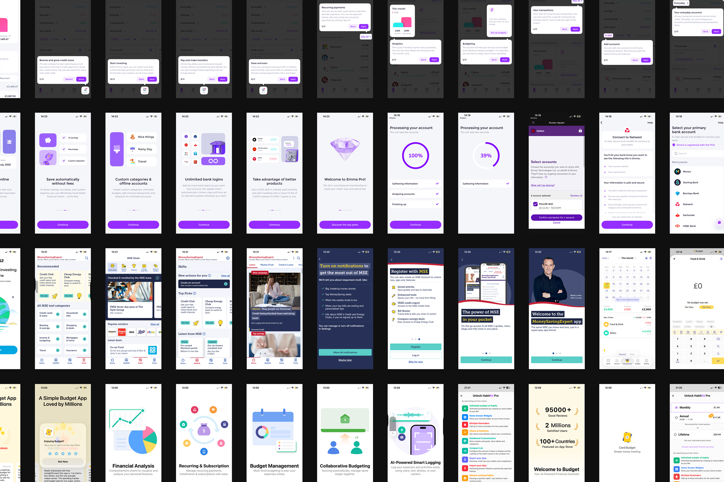
I also tested a wide range of existing budgeting apps. While bank connectivity was generally strong, auto-categorisation was often inaccurate especially when purchases from the same merchant (e.g. Amazon) belonged to completely different spending categories. Most apps still required scrolling through long transaction lists to find this, spammed notifications, or attempted to sell financial products rather than helping users stay consistent with their budgeting goals. This frustration led directly to the idea for Swipe Save.
To better understand what works (and what doesn't), I screenshotted every screen of the budgeting apps I tested, analysing their onboarding flows and key interactions. This helped inform which patterns felt intuitive, which felt overwhelming, and where there was room to simplify and improve the experience.
Pain Points I Wanted to Solve
- I want to know exactly where my money goes
- Auto-categorisation is unreliable
- Spreadsheets and manual uploads feel like boring admin
- Effortless bank connectivity is essential
- Budgeting should feel fun, not like a chore
- Staying consistent should be easy
- I don't want to be sold financial products
Of these, bank connectivity was by far the most challenging problem to solve so I focused on that first.
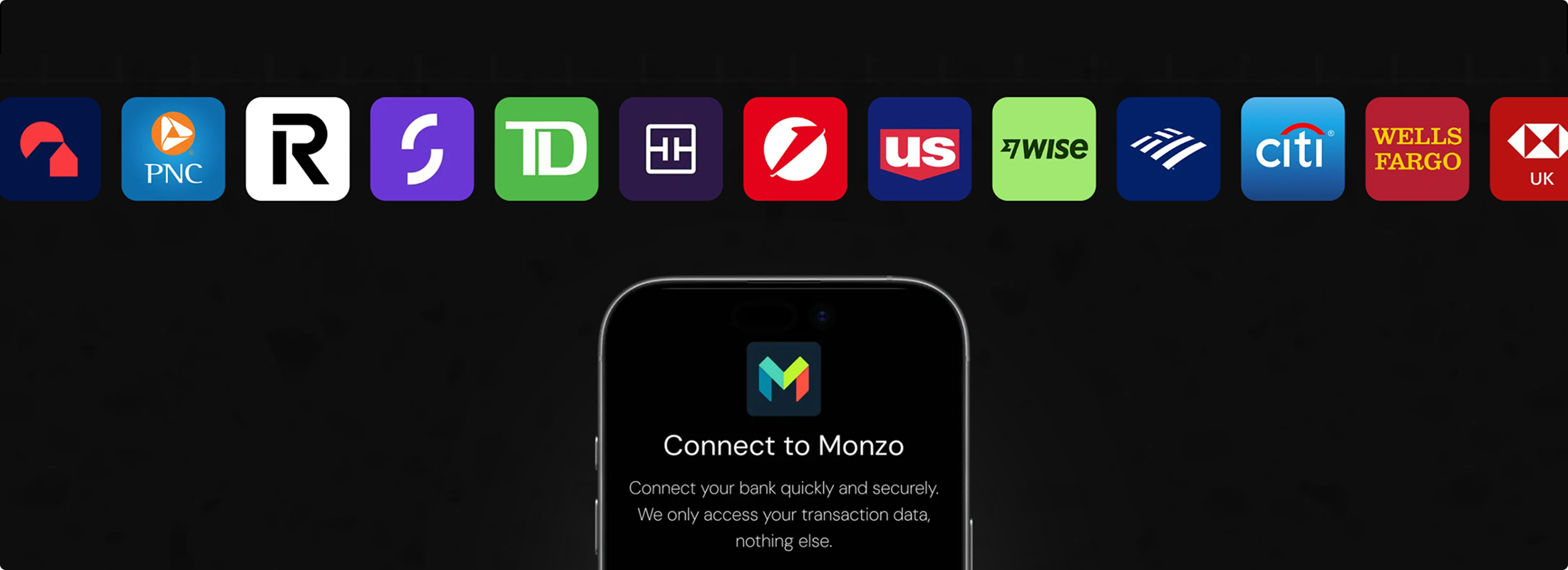
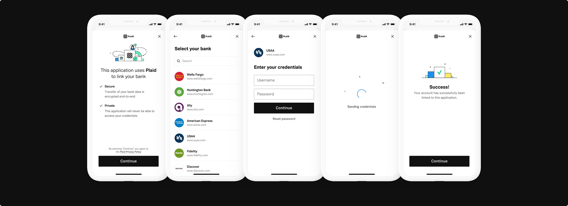
I integrated Plaid, a service that allows apps to connect to thousands of consumer banks across the US, UK, and Europe via API. Plaid is used by well-known products such as Venmo, Robinhood, Chime, Acorns, and Coinbase.
I successfully connected Swipe Save to Plaid's sandbox environment, allowing the app to authenticate with test banks and display mock transaction data. This proved the technical feasibility of the core experience.
(See screen recording of an early local build running on my iPhone and connecting to the Plaid sandbox.)
The next step is applying for access to Plaid's production API. To be approved, the app must meet a series of compliance and security requirements—work I'm actively continuing as I move towards launch.